Application Designer is a tool in the IoT cloud platform that helps users quickly develop applications
and visualize device data.
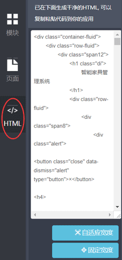
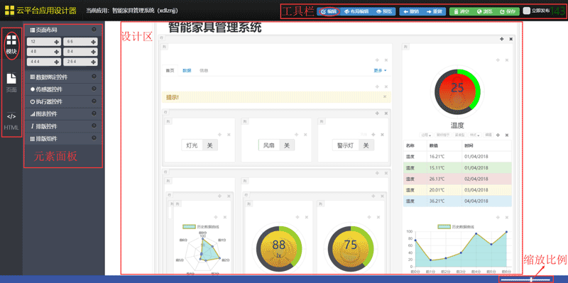 On the far left side of the application designer, there are three development options: modules, pages,
and HTML, which correspond to different dashboards.
On the far left side of the application designer, there are three development options: modules, pages,
and HTML, which correspond to different dashboards.
Through the Elements panel, you can set page properties, drag and drop widgets to add them to the design
area to quickly build an application.
The toolbar provides a number of useful shortcuts for app development.
The zoom tool in the lower-right corner gives you the flexibility to adjust the scale of the design
area.
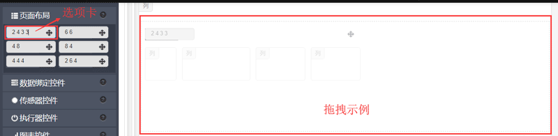
By dragging and dropping the controls in the page layout into the design area, you can customize the
column and column layout. At the same time, the layout control is not only limited to the default
setting value of the control in the panel, you can set the grid layout by clicking the tab of the layout
control, the total number of grids is 12 by default,
Splitting the grid of each column with a space and then dragging and dropping the widget into the design
area allows users to design a more unique application layout.
 The basic property controls of the project and device are listed in the Data Binding Controls panel, and
users can drag and drop the data binding controls into the page according to their needs.
The basic property controls of the project and device are listed in the Data Binding Controls panel, and
users can drag and drop the data binding controls into the page according to their needs.
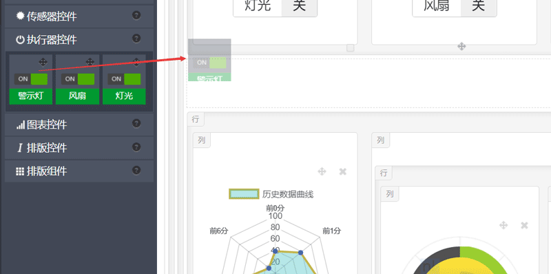
 When the application designer is initialized, it will load all the sensor and actuator information under
the current application, and generate the corresponding default controls, which can be added to the
application by dragging and dropping the controls.
The sensor control can observe the data of the device in real time, and the actuator control can display
and control the status of each actuator under the device.
When the application designer is initialized, it will load all the sensor and actuator information under
the current application, and generate the corresponding default controls, which can be added to the
application by dragging and dropping the controls.
The sensor control can observe the data of the device in real time, and the actuator control can display
and control the status of each actuator under the device.
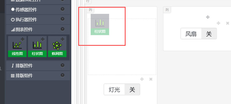 The chart control more vividly presents the sensing data within a certain time range.
application
designer customizes three forms of charts for users, namely linear charts, histograms, and spider
charts, which can be bound to a sensor by defining the attribute window of the chart, and intuitively
displays the changes in the sensor's historical data.
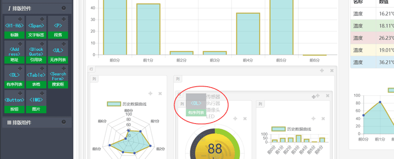
Typography controls provide controls such as labels, lists, tables, buttons, and more for app
development, adding more options to the combination of elements of your app design.
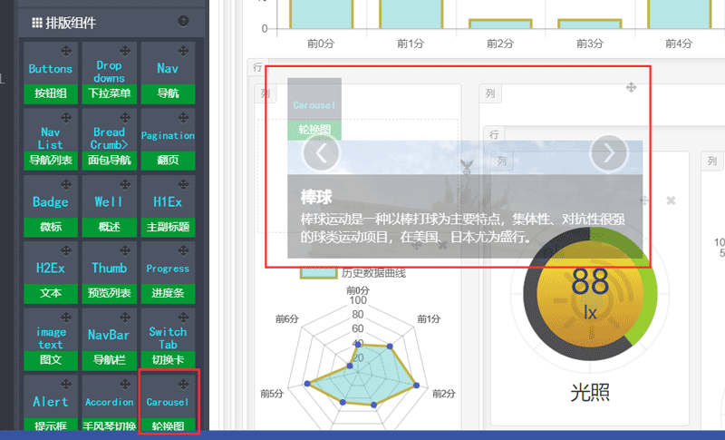
 The Layout Components panel contains a wealth of web components that you can use to quickly build a
beautiful, fully functional page.
The Layout Components panel contains a wealth of web components that you can use to quickly build a
beautiful, fully functional page.
The app designer binds editing options to all controls, and you can display the formula bar for the
current control by hovering over it.
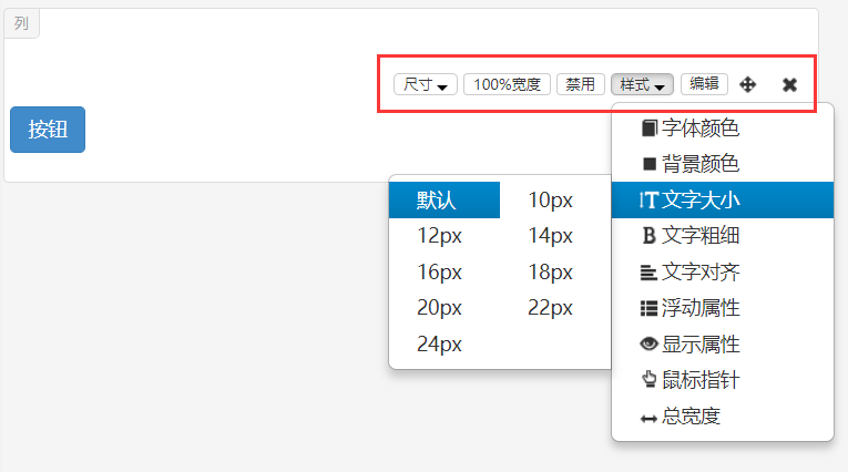 The designer customizes different formula bar options for each control, and users can make styling
changes by selecting from the options menu on the edit bar.
The designer customizes different formula bar options for each control, and users can make styling
changes by selecting from the options menu on the edit bar.
 The designer provides more concise editing operations for data-bound and complete controls such as
charts and sensors, and the edit box can be brought up by clicking the style button in the upper right
corner of the control, and users can easily modify the style of the control by simply changing the
default value of the control properties.
The designer provides more concise editing operations for data-bound and complete controls such as
charts and sensors, and the edit box can be brought up by clicking the style button in the upper right
corner of the control, and users can easily modify the style of the control by simply changing the
default value of the control properties.

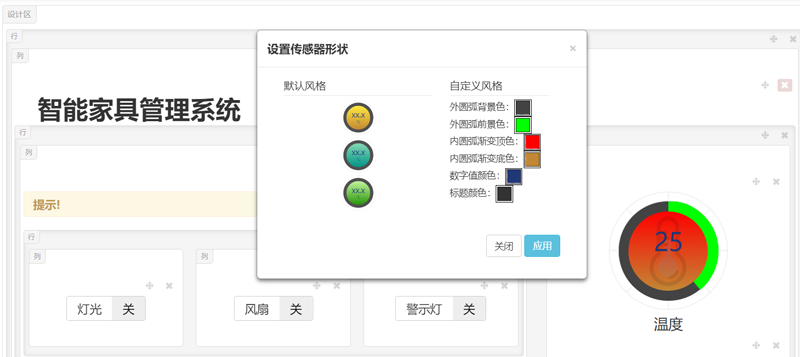 The designer sets a unified edit button in the edit bar of the custom control, which can perform
specific and detailed operations on the control in the outgoing edit box, and at the same time modify
the source code of the control, so that the user has a higher degree of design freedom.
The designer sets a unified edit button in the edit bar of the custom control, which can perform
specific and detailed operations on the control in the outgoing edit box, and at the same time modify
the source code of the control, so that the user has a higher degree of design freedom.

The toolbar provides a series of quick actions for app development.
 The app design is automatically saved every 3 minutes to reduce the loss of accidental data loss when it
is not saved, and when the "Publish Now" checkbox is checked, the app will be automatically published at
the same time as the app design is saved.
The app design is automatically saved every 3 minutes to reduce the loss of accidental data loss when it
is not saved, and when the "Publish Now" checkbox is checked, the app will be automatically published at
the same time as the app design is saved.
The toolbar has three operating mode options: Edit, Layout Edit, and Preview.

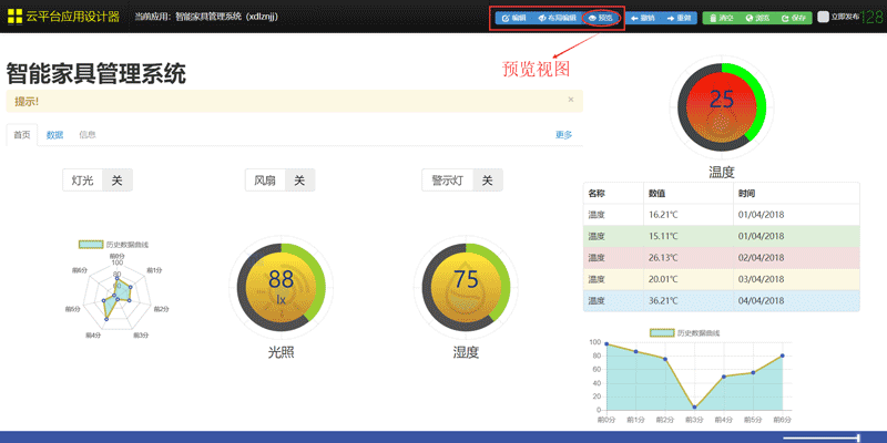 Undo and redo provide quick callbacks for actions, and clicking the Clear button will delete all
controls in the current design area, rendering a blank design area.
Undo and redo provide quick callbacks for actions, and clicking the Clear button will delete all
controls in the current design area, rendering a blank design area.
Click Browse to jump to the generation page of the app, and the Save button can manually save all the
current designs.